CURATORIAL FOCUS
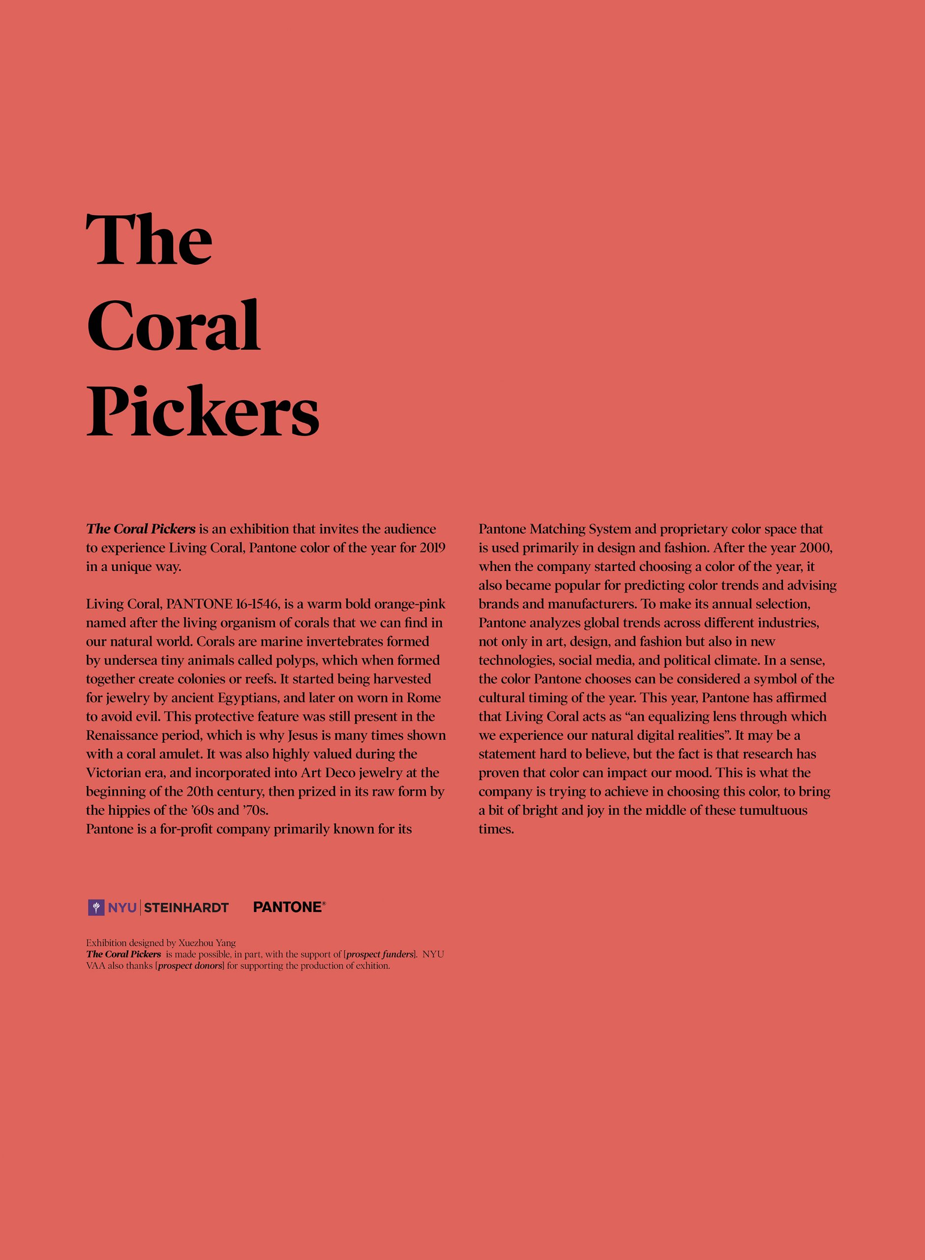
The exhibition “The Coral Pickers” is an in-depth survey of the relationship among objects/artworks and their different use of the color 16-1546 Living Coral, Pantone’s color of the year for 2019. Analyzing the influence that many artistic experiments have within the rationale of adopting this particular color in their work. We approached this concept by juxtaposing design and daily objects with artworks from different periods noted for their unique historical, cultural, political, social and artistic significance with the contemporaneity of Living Coral. Leatrice Eiseman, the director of the Pantone Color Institute says, “Color is an equalizing lens through which we experience our natural and digital realities and this is particularly true for Living Coral.
With consumers craving human interactions and social connections, the humanizing and heartening qualities displayed by the convivial Pantone Living Coral hit a responsive chord.” We will contemplate a conversation between the selection of works throughout the history and the very presence of the trend of Living Coral at this time to see the progression of how these works prompted, influenced and formulated product development and purchase decisions in multiple industries, including fashion, furnishings, and industrial design, as well as product, packaging, and graphic design.
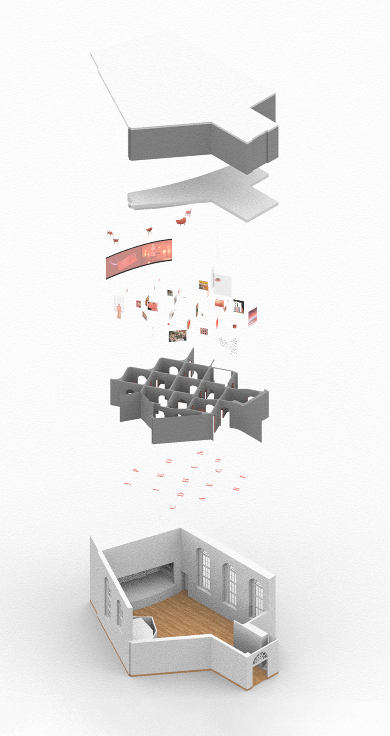
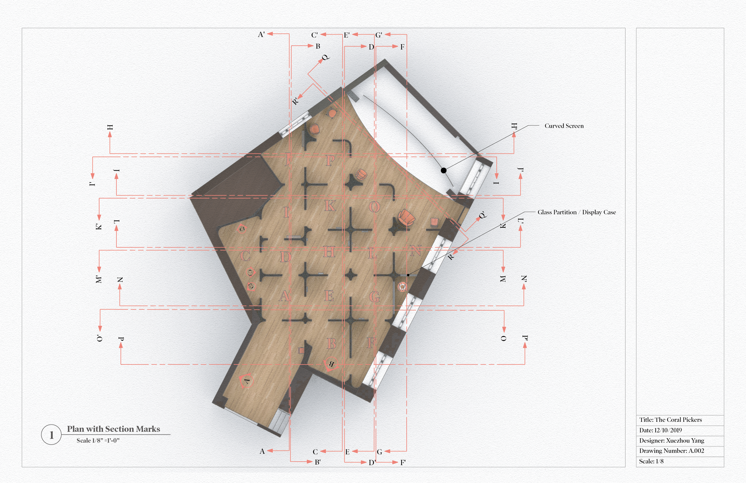
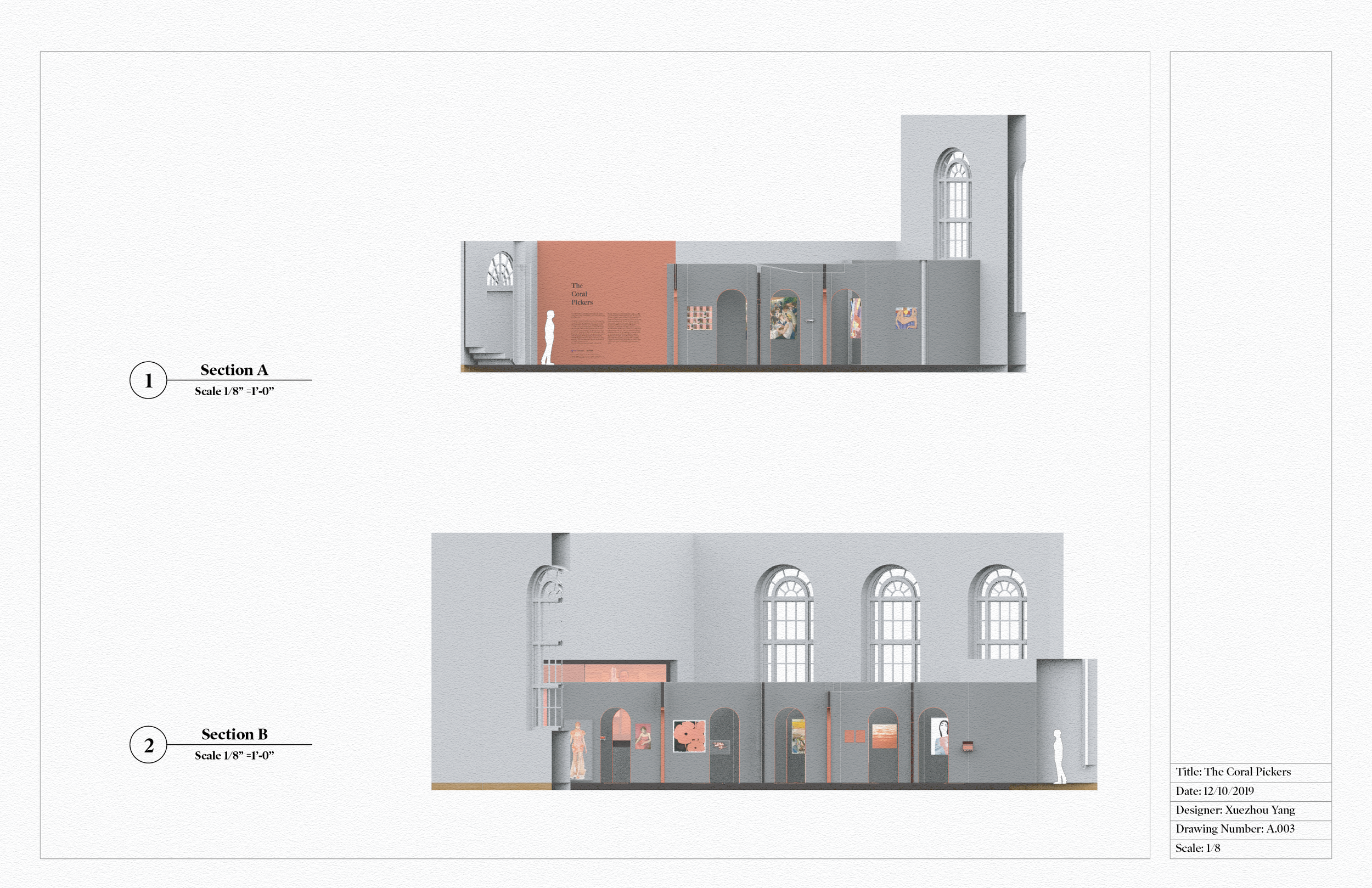
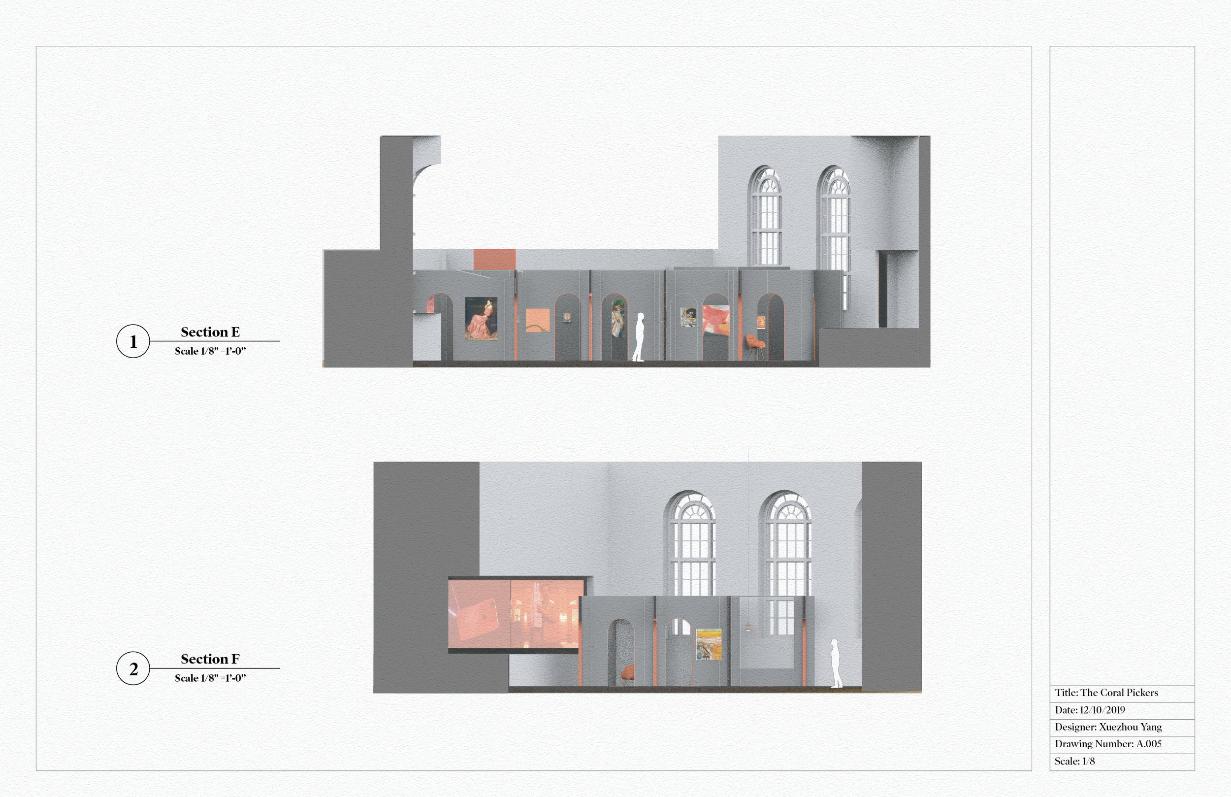
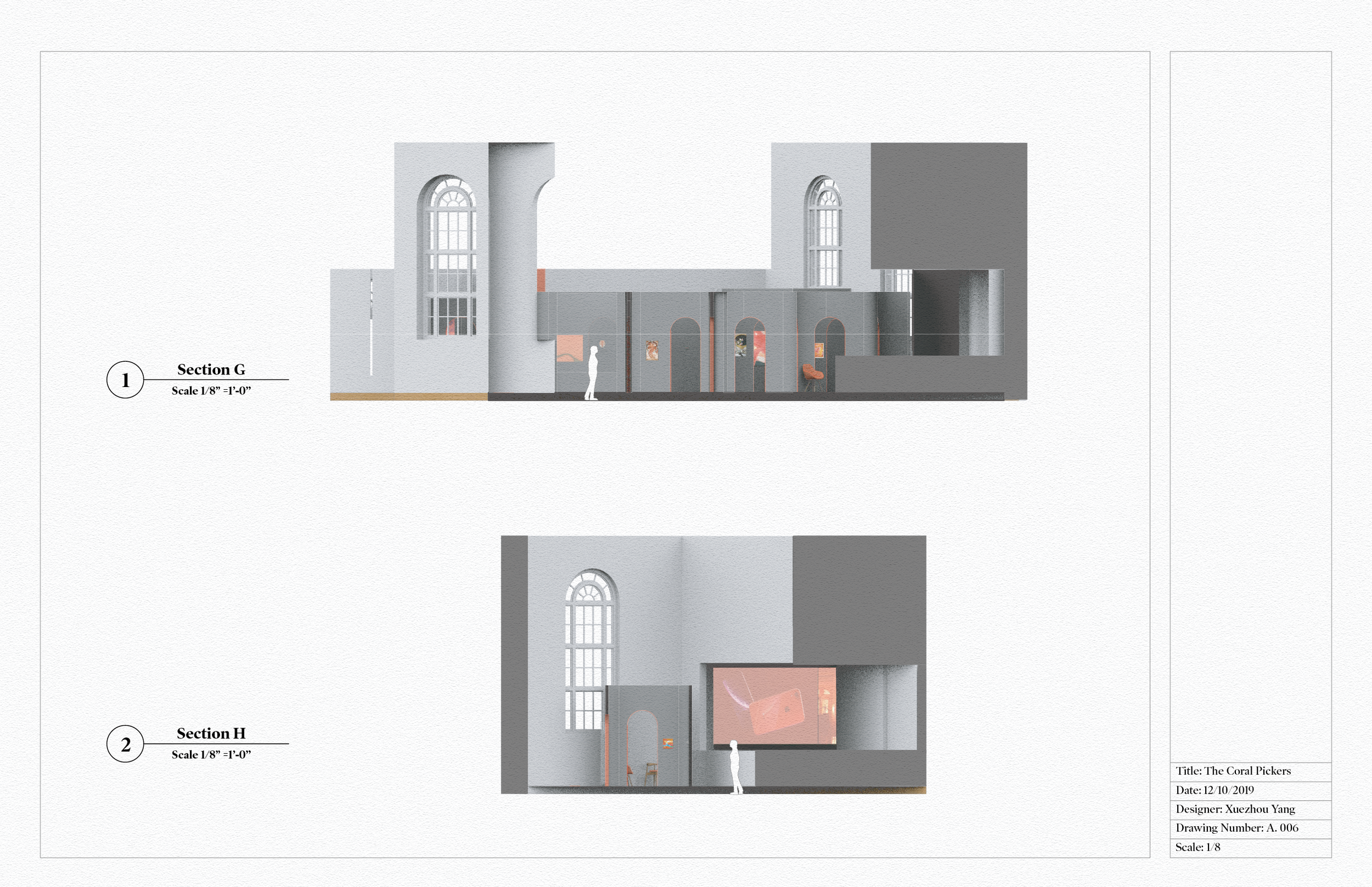
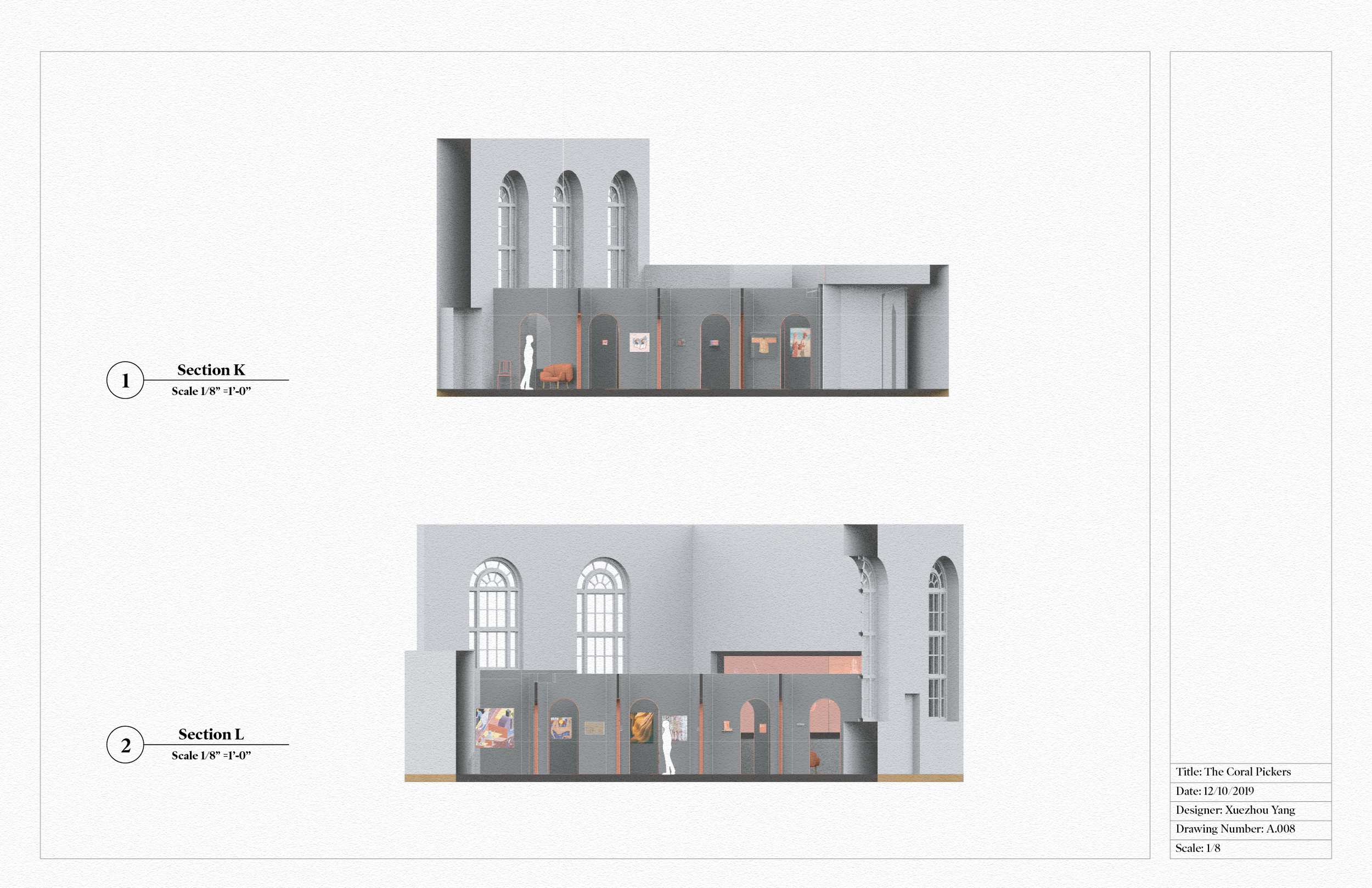
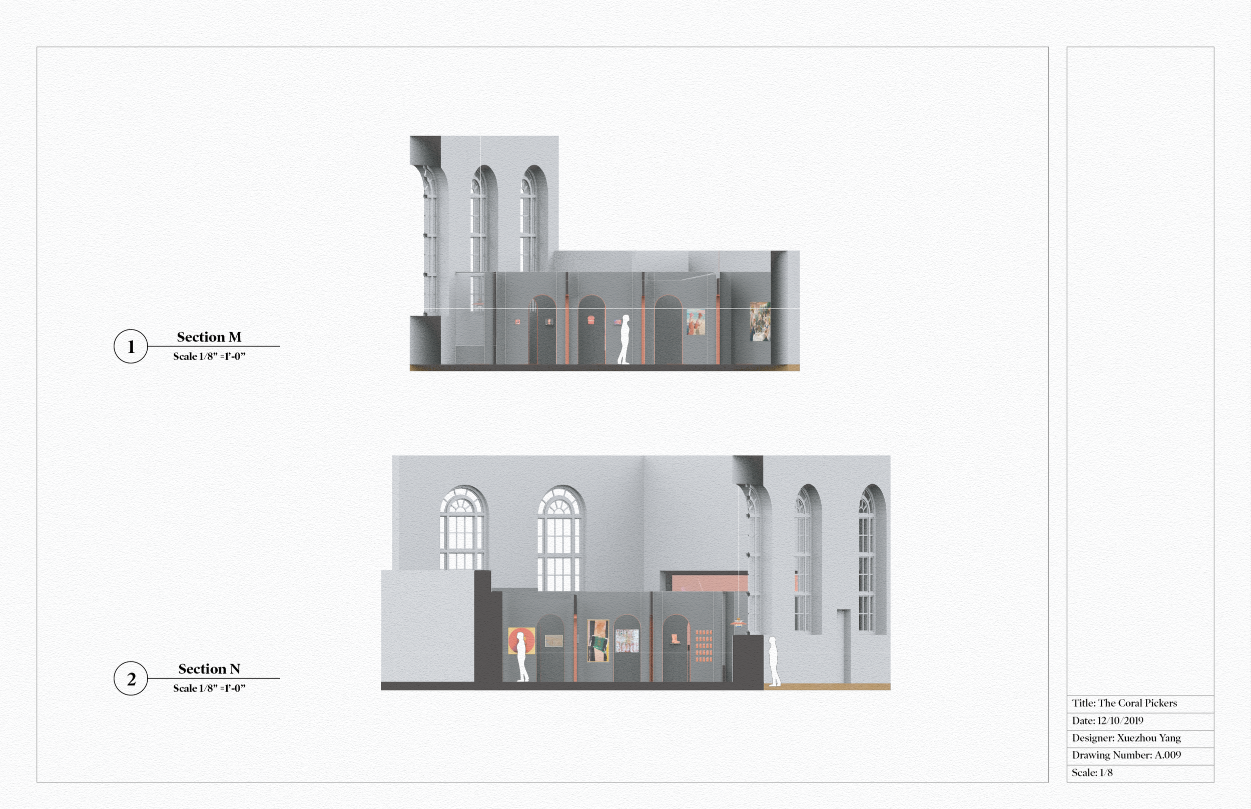
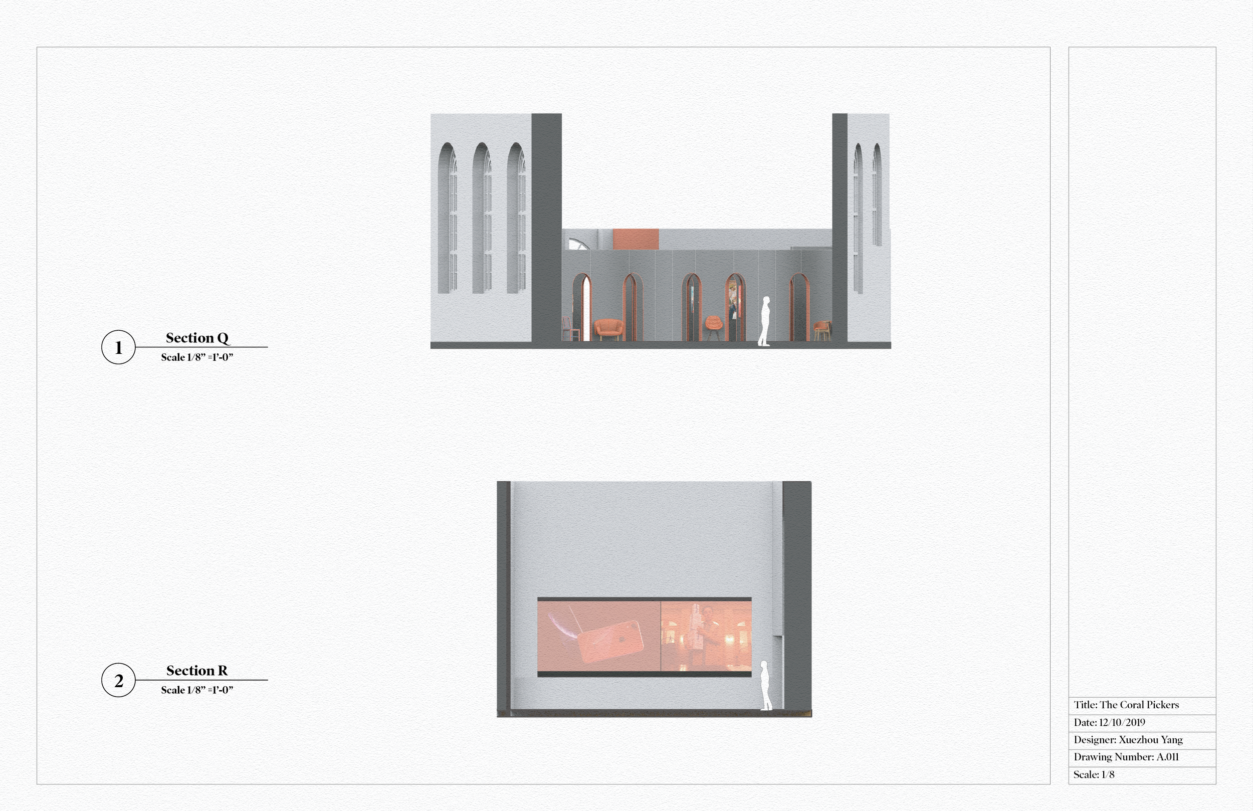
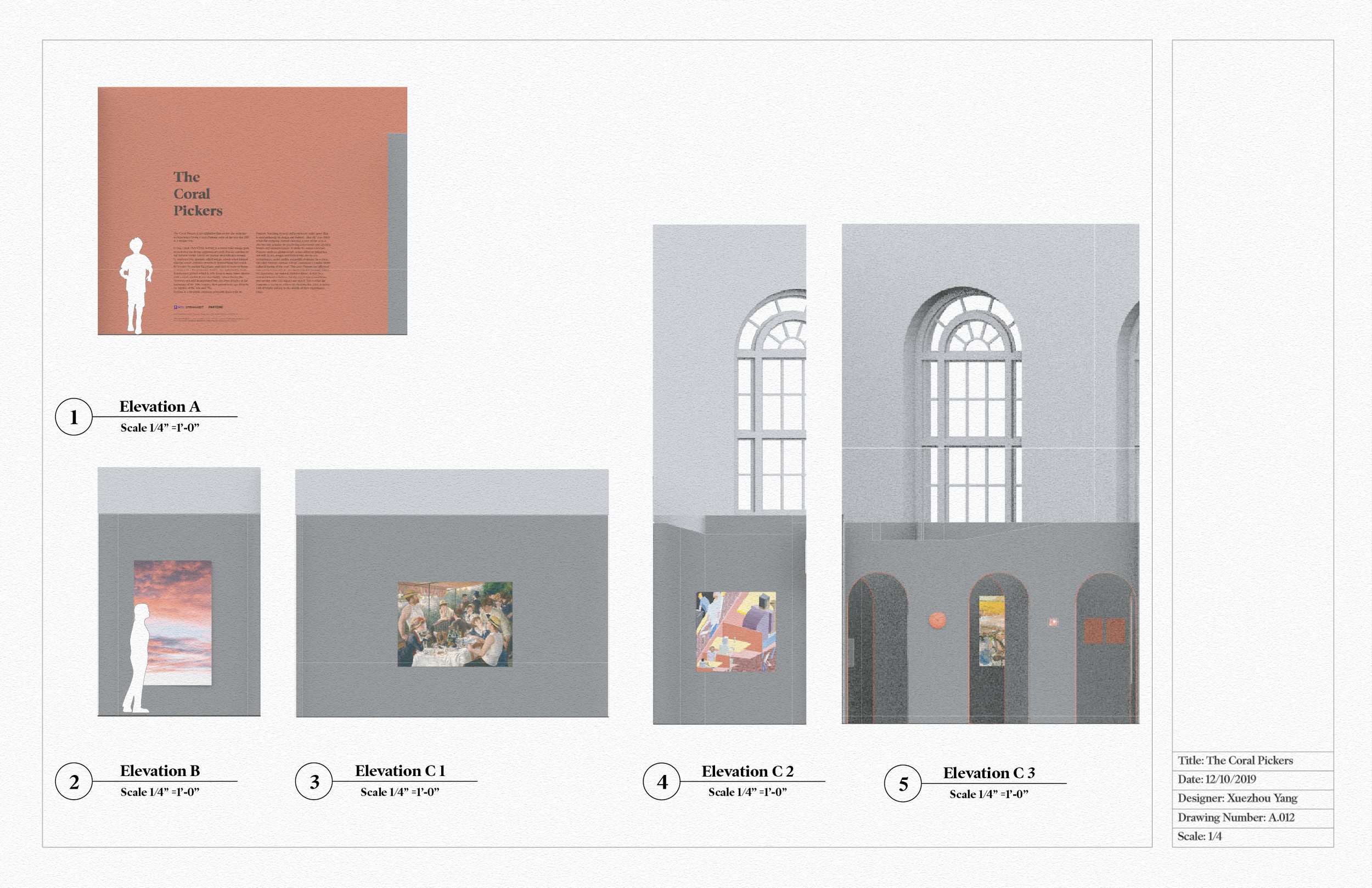
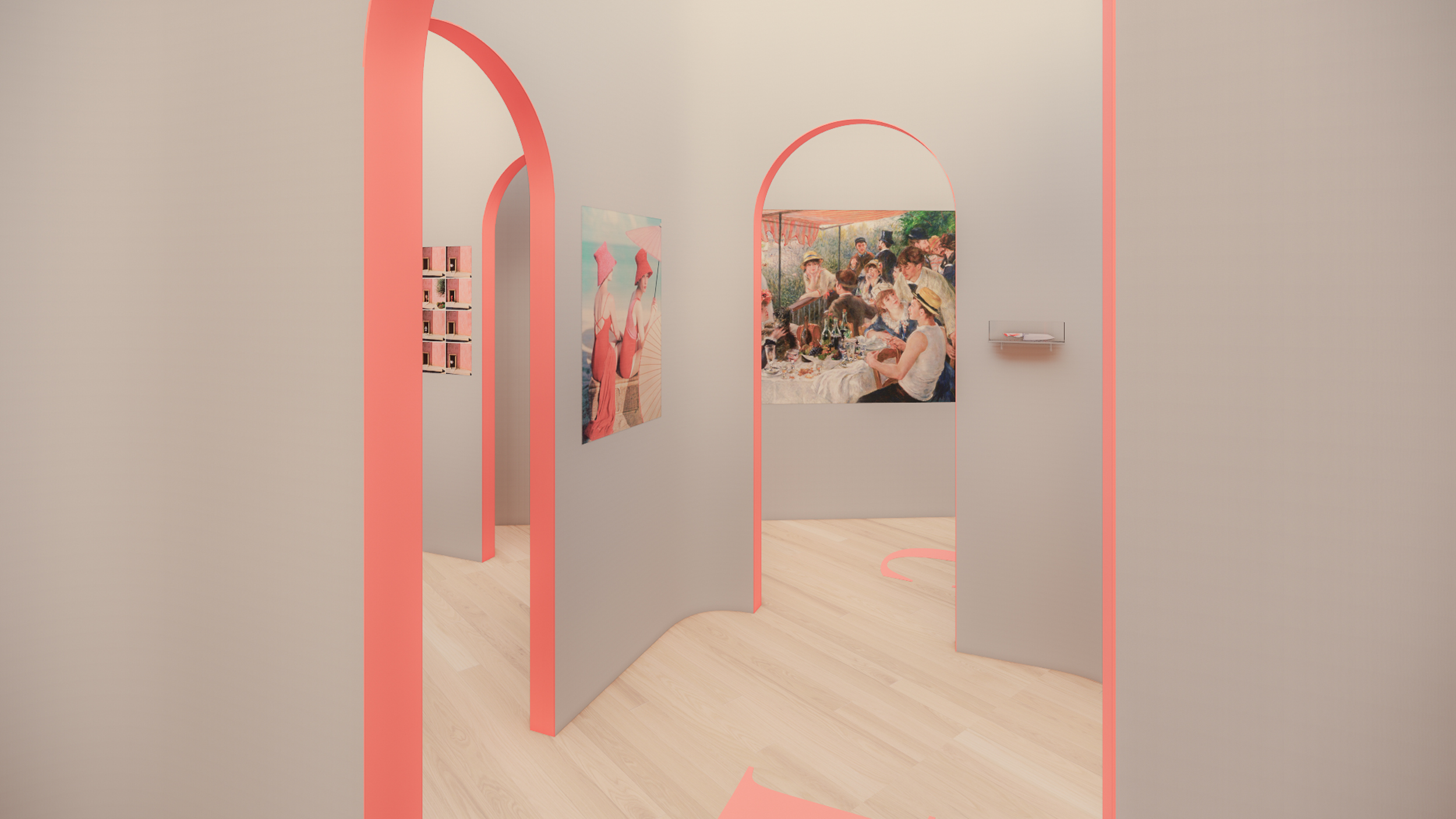
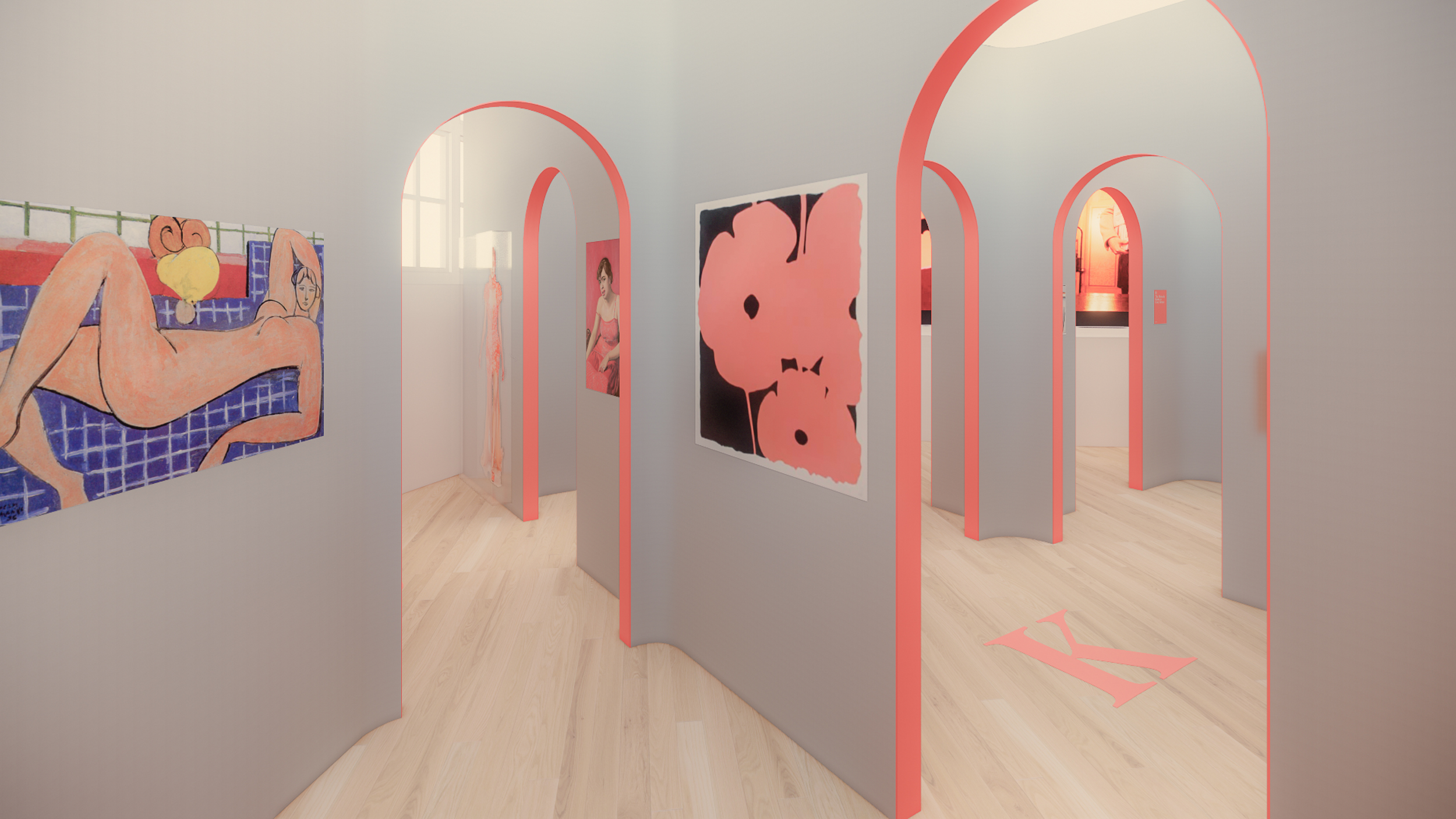
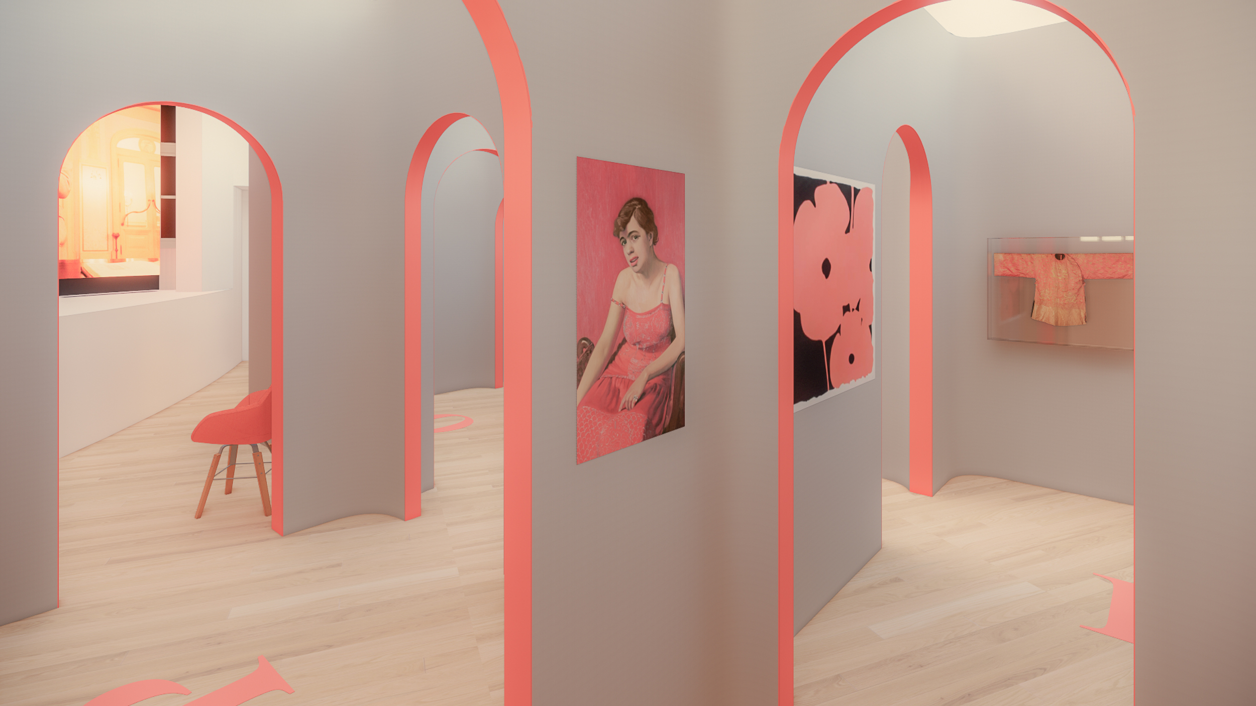
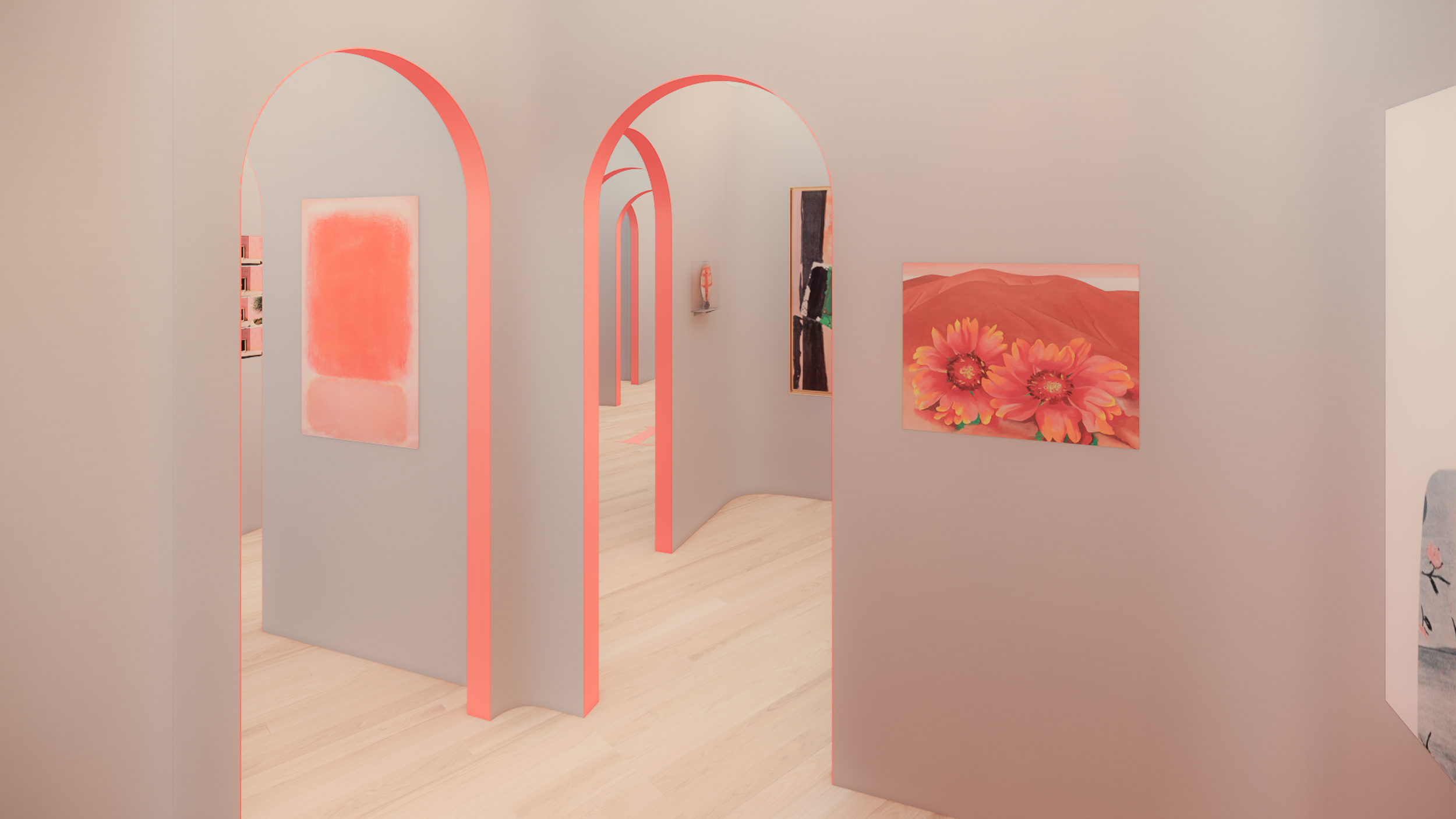
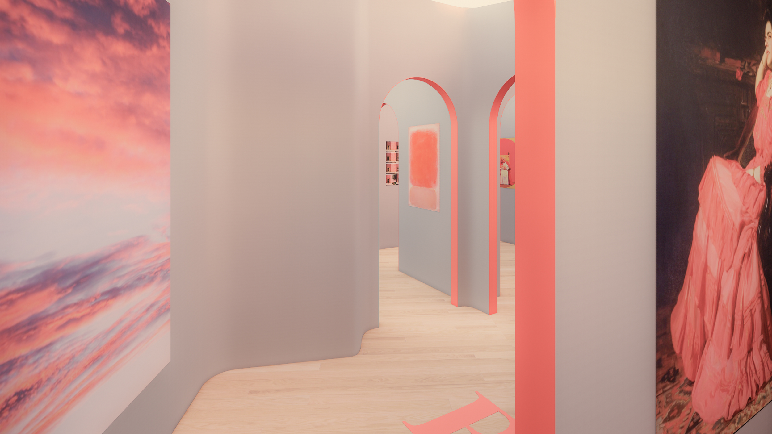
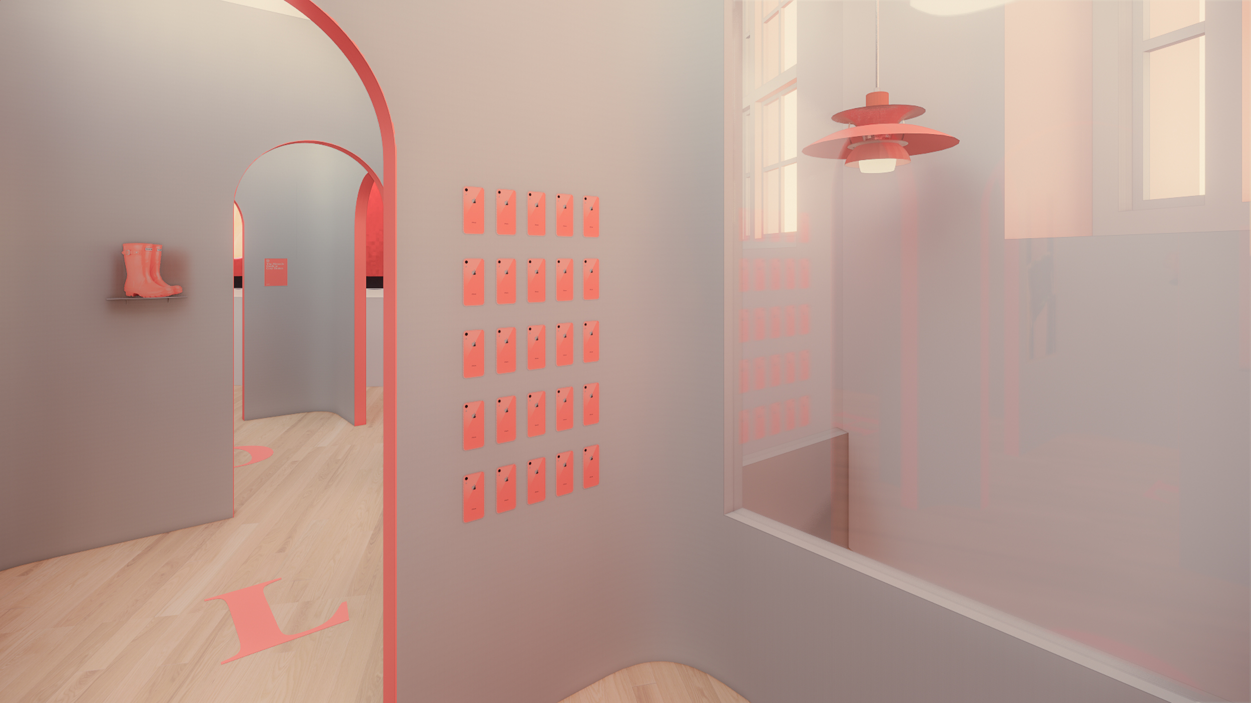
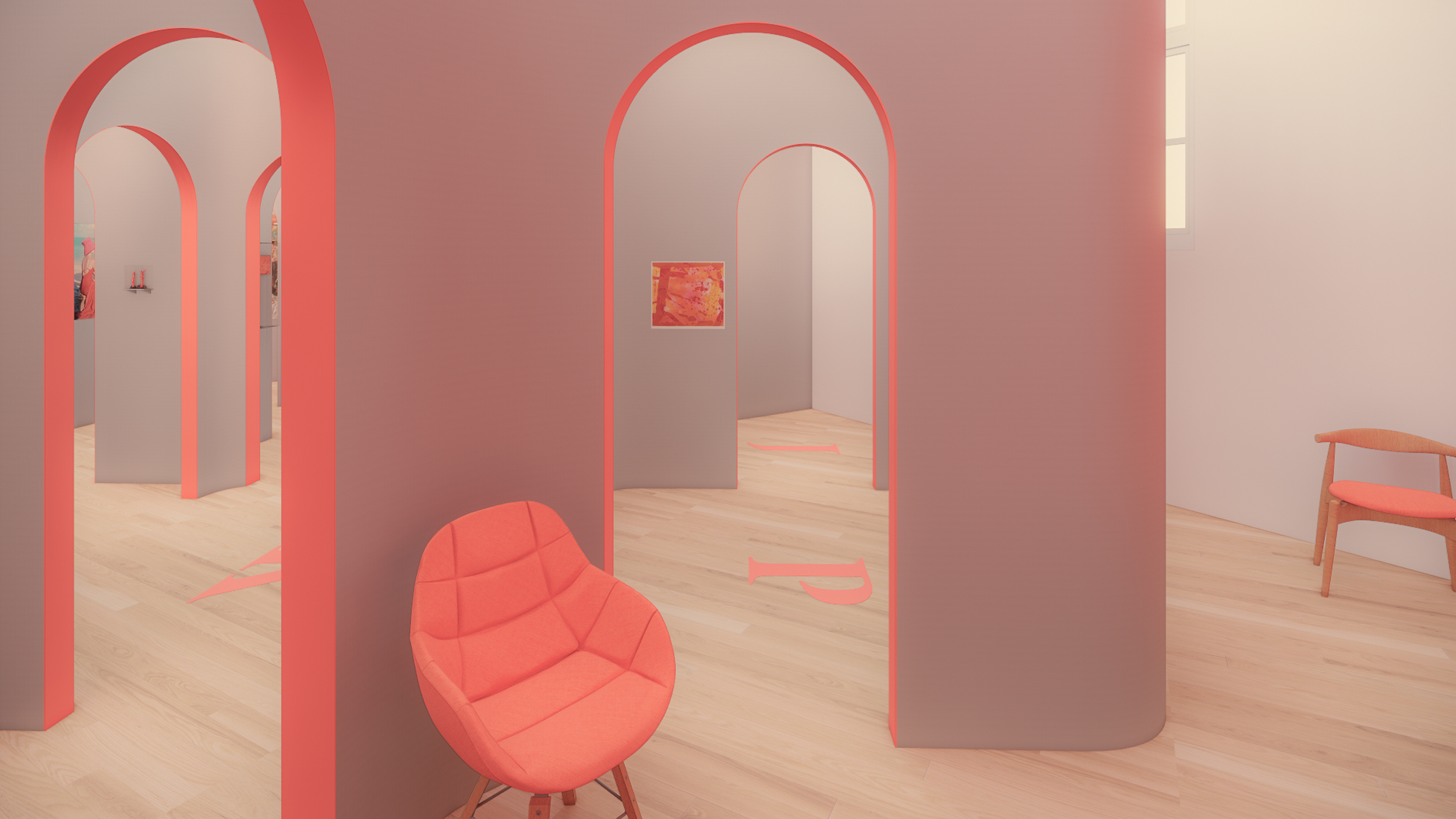
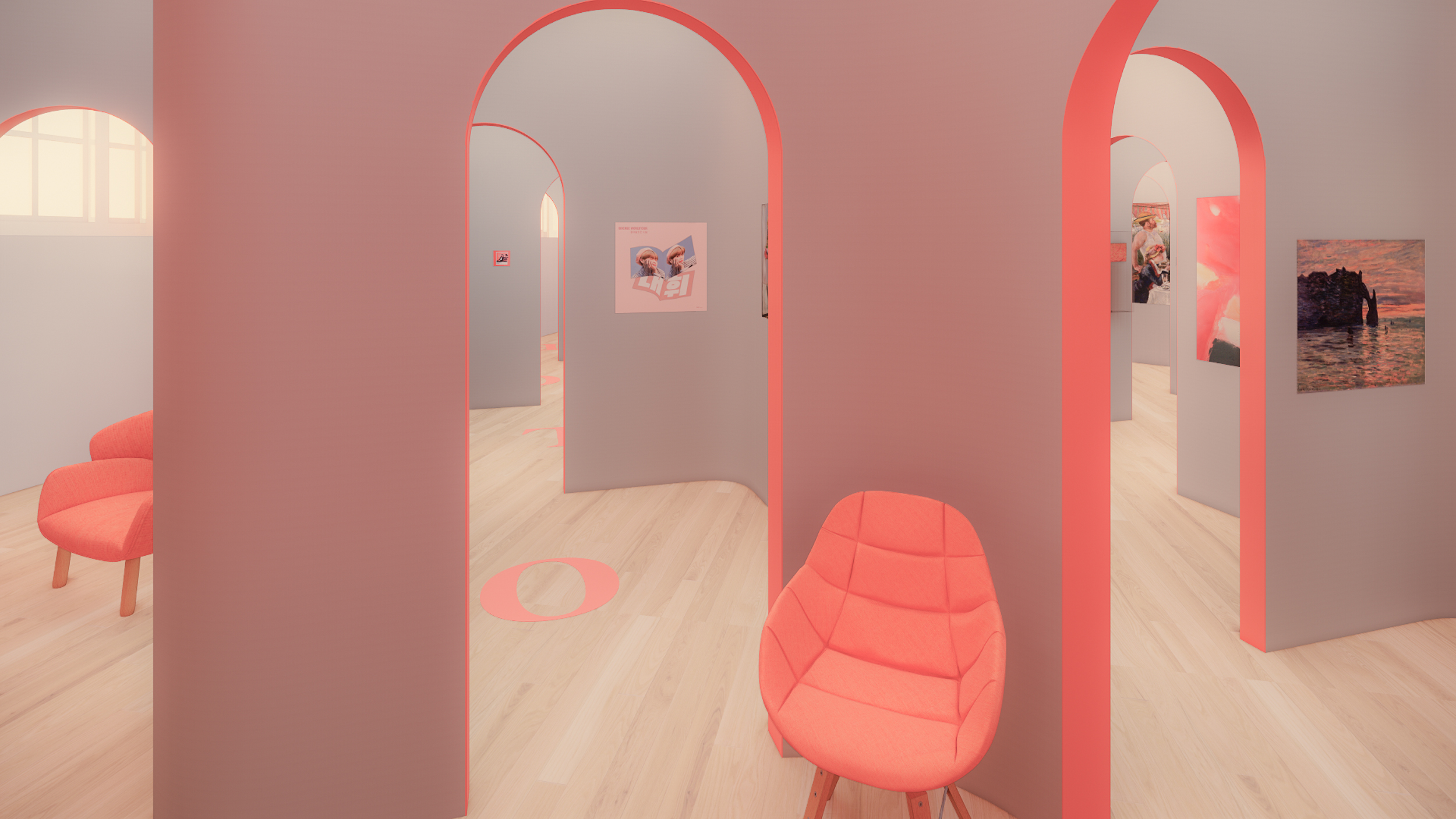
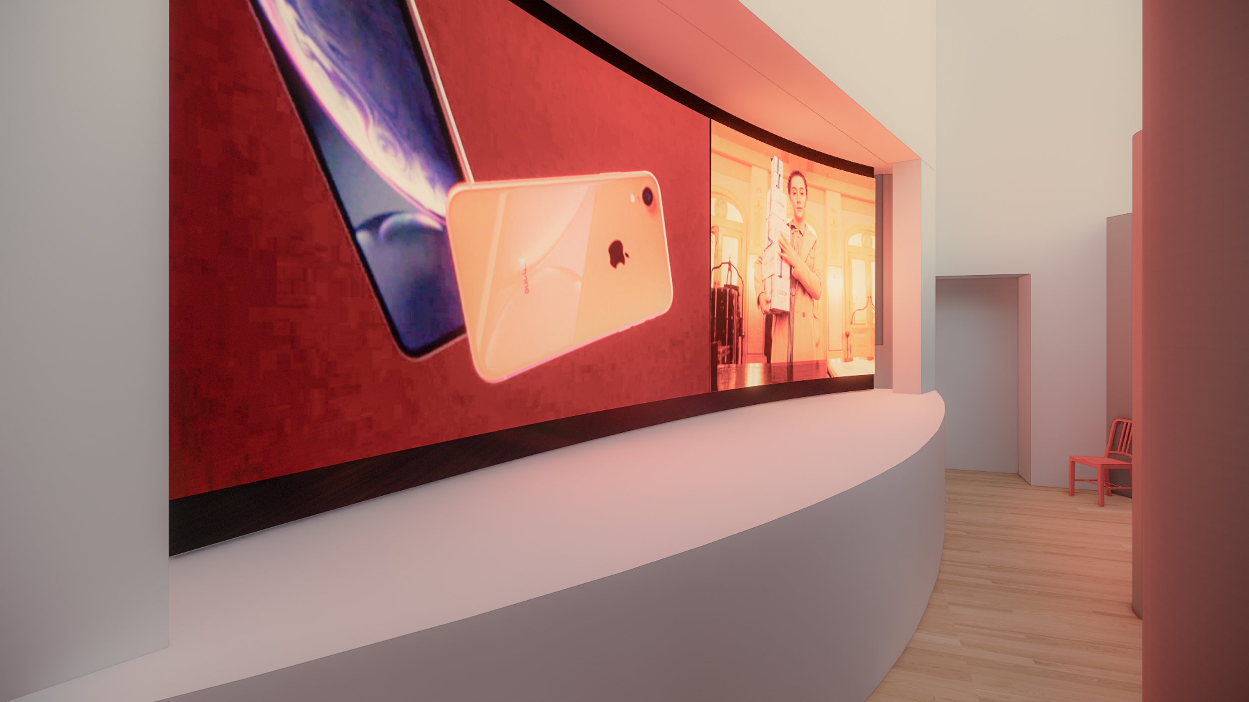
The display of the exhibition invites the audience to experience Living Coral, Pantone color of the year for 2019, in a unique way. It encourages a diverse audience to interpret this particular color choice used in different manners by artists, designers, and craftspersons presented together in this exhibition space. The viewer will be constantly taking the decision of which pieces to see or which path to take, playing with the color while experiencing the influence it has in our daily lives. The juxtaposition of artworks with design and everyday objects brings us to a different understanding of the use of a color, which will leave us questioning our choices at the end of the exhibition. Where we will encounter different films and commercials that bring together all the different perspectives of choosing a color. For this reason, we have decided that the space of the exhibition will be divided into several rooms where you will have to take the decision on which next room to enter and which piece to see: an artwork or an object, simulating a kind of maze.
The Commons Gallery itself is certainly a great architectural playground as it contains multiple levels. We have decided to leave the Mezzanine open to visitors, to be able to analyze the decisions taken by the visitors of the exhibition, as a way of experiencing the show from a different perspective. From all the above, the Smithsonian Guidelines for Accessible Exhibition Design has been our source of reference as we attempt to construct rule-based designs. In the end, this exhibition invites the audience to question the use of color, its evolution and commodification. While it may suggest the exhibitor’s opinion, it leaves that choice open to the public and their own conclusion after experiencing the exhibition.
DELIVERABLES
Curatorial Content /
Graphic Design /
Exhibition Design /
Art Direction /
/ / / / / / / / / / / / / / / / / / / / / / / / / / / / / / / / / / / / / / / / / / / / / / / / / / / / / / / / / / / / / / / / / / /
CLIENTS
NYU PANTONE
CONTENT
Xuezhou Yang
ART DIRECTION
Xuezhou Yang
DESIGNERS
Xuezhou Yang Jingwei Wu
